

Best practices of SaaS product design
March 13, 2025
Inha Tolochenko

We've put together a guide on how to create a SaaS product design that drives success, generates revenue, and delivers value to your customers
Many SaaS companies invest significant resources in their products, hoping for great results, but often fail to get the expected result. The reasons for this can vary from improper marketing to misunderstanding user needs. However, the main problem often lies in the interface of the product. Many services are difficult to use and the main functions are not intuitive. Users may not know how to perform basic actions or understand where to find the functionality they need.
We've put together a guide on how to create a SaaS product design that drives success, generates revenue, and delivers value to your customers.

SaaS products are more than just applications – they are complex, efficient systems designed to gain and retain users over time.
SaaS interface prioritizes convenience, logic, and seamless integration into user workflows. That’s why SaaS design is a holistic approach to building products that enhance efficiency for users and drive business growth.
Let’s break down the main features of SaaS product design principles.
1. Focus on long-term use
Unlike mobile apps or e-commerce sites, SaaS products are designed for regular, ongoing use. It means that the user interface should be clean, simple, and free of any unnecessary elements. Minimal cognitive load – UI should assist, not distract. Also, focus on logical navigation for quick access to key functions.
2. Deep integration with business processes
SaaS products often serve as essential tools for businesses, so the design must reflect:
- A flexible role system with different access levels for admins, managers, and customers
- Built-in analytics and reporting to support decision-making
- Scalability, allowing the product to expand without compromising UX
3. Complex onboarding and training
While mobile apps should be intuitive from the first tap, SaaS products often require a structured onboarding process to familiarize users with their full capabilities. Key elements include:
- Interactive tips and tutorials
- Comprehensive documentation and video guides
- Gamified onboarding to engage users step by step

4. Optimization for conversion and user retention
For a subscription-based SaaS business, the goal isn’t just to attract users – it’s to keep them. UX design plays a crucial role in this by:
- A well-structured premium model and compelling upgrade pitch
- Clear CTA buttons for seamless subscription upgrades
- Features that encourage continued use, like personalized notifications

5. Flexibility and customization
Since SaaS products cater to diverse user segments, adaptability is key:
- Customizable workspaces to fit different workflows
- API integrations for seamless connectivity with other services
- The ability to expand functionality without cluttering the core interface

A SaaS product’s revenue is closely tied to its design and user experience. The right UX/UI approach influences every stage of the monetization funnel – conversion, retention, upselling, and scalability. When a product is easy and enjoyable to use, users stay longer, upgrade more often, and recommend it to others.
Investing in high-quality UI and UX isn’t just a cost – it’s a strategic move for scaling a SaaS business.
When users struggle with a confusing interface, they leave.
A cluttered, unintuitive design can quickly lead to failure. To ensure your SaaS platform keeps users engaged and satisfied, we’ve compiled a set of essential design principles. Let’s explore the key strategies that will take your product from functional to exceptional.
Create a сlear and intuitive interface structure
The foundation of a great SaaS UI design starts with an intuitive and well-organized interface. Prioritize key features by using larger buttons, distinct typography, and strategic placement. Secondary features should take a backseat with more subtle styling to reduce clutter.
To prevent overwhelming users, organize related functions into logical categories with clear labels. Thoughtful use of whitespace can improve readability and guide attention to essential actions, making the platform feel more spacious and accessible. A well-structured hierarchy ensures users can navigate effortlessly and stay engaged with the product.

Streamline the sign-up process
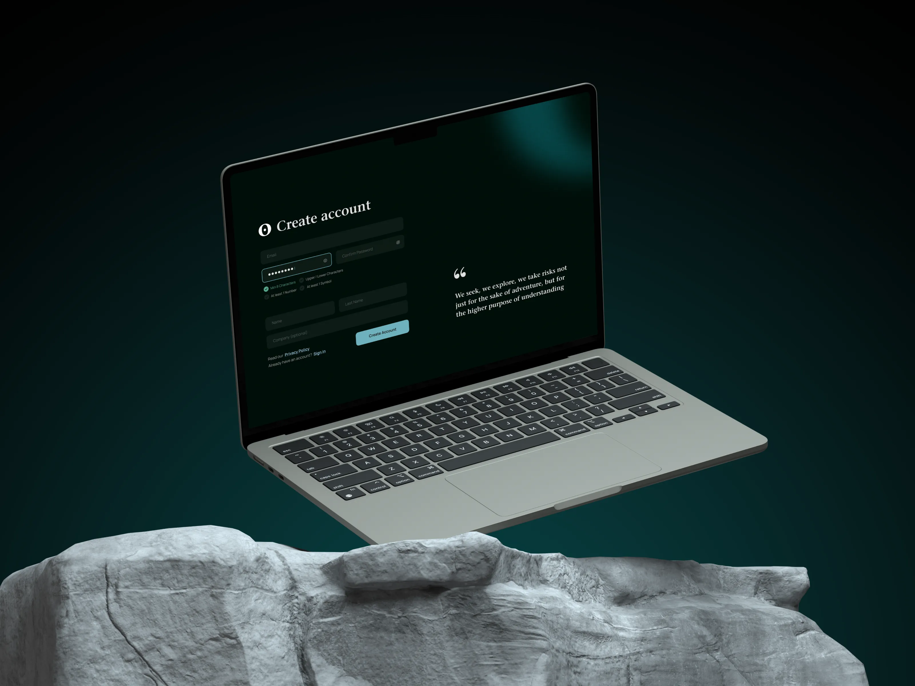
Long, complex sign-up forms put users off. Keep the onboarding process quick by asking only for necessary details – name, email, and password. Where possible, integrate social sign-in options (e.g., Google, Apple, or LinkedIn) to allow seamless account creation with a single click.
To boost user experience, display a progress indicator during sign-up. This reassures users about how much more is left to complete, encouraging them to follow through. Also, use clear and action-driven button labels like “Start Free Trial” or “Join Now” to eliminate hesitation.
For additional user details, adopt a progressive profiling approach – collect relevant information gradually as users interact with specific features rather than overwhelming them upfront. For instance, if someone attempts to access a premium feature, prompt them to provide additional details only at that moment.

Make onboarding effortless & engaging
A confusing start leads to user frustration and drop-off. Guide new users with a structured onboarding experience that feels welcoming and interactive. Instead of text-heavy tutorials, add:
- Step-by-step walkthroughs to highlight key features
- Tooltips and contextual guidance to provide help when needed
- Gamification elements, such as progress bars or achievement pop-ups, to keep users motivated
Additionally, celebrate key milestones with subtle animations or congratulatory messages. A warm welcome email or in-app notification thanking users for completing onboarding can enhance engagement and create a positive first impression.

Use familiar design patterns
Users instinctively recognize common UI patterns, which reduces friction and learning curves. Stick to widely accepted design conventions to make navigation effortless:
- Hamburger menus for mobile navigation
- Floating action buttons for key interactions
- Prominent search bars at the top of the page
Call-to-action (CTA) buttons should follow standard formats, such as “Upgrade Now” or “Get Started”, making it clear what users should do next. Using universally recognized icons instead of text when appropriate helps save space and maintains a clean interface.
Avoid reinventing the wheel with experimental layouts that may confuse users. Instead, apply well-established patterns that align with user expectations, ensuring a smooth and consistent experience across different sections of your SaaS platform.
For further tips on user behavioral features in interfaces, explore our in-depth guide "10 usability heuristics: everything you need to know".
Prioritize accessibility & responsive design
With users accessing SaaS products from various devices, responsive design is non-negotiable. Your platform should adapt seamlessly to desktops, tablets, and smartphones, ensuring consistent usability across screen sizes.
To enhance accessibility:
- Implement adaptive layouts that restructure content dynamically
- Use progressive disclosure techniques (e.g., collapsible menus) to prevent information overload on smaller screens
- Make all interactive elements keyboard-friendly for those who navigate without a mouse
- Increase button and tap target sizes for effortless mobile interactions
Furthermore, ensure high-contrast themes and customizable color palettes to accommodate users with visual impairments. Provide descriptive alt text for images and non-text elements to improve screen reader compatibility.
Structure complex data with user-friendly dashboards
Staring at overwhelming data can frustrate users, making dashboards a critical area for clarity and usability. Since the human brain processes visuals faster than text, leverage charts and graphs (such as bar charts, line graphs, or pie charts) to simplify complex information.
Instead of just presenting raw data, make dashboards interactive. Enable users to filter, sort, and drill down into specific metrics for deeper analysis. Giving them control over how they view data makes insights more actionable.

Implement a smart and efficient search function
A well-designed search feature should act as a shortcut, helping users find information quickly and effortlessly. Position it prominently at the top of every page, ensuring easy access. Autocomplete suggestions can anticipate user intent as they type, speeding up the process.
Beyond simple keyword searches, provide advanced filtering options based on categories, date ranges, authors, or other relevant attributes. Allow users to save frequently used searches and retain search history, creating a personalized and time-saving experience.
A search system that learns from user behavior - offering predictive suggestions and remembering past queries - ensures that finding relevant information is seamless and intuitive.

The real challenge is keeping users engaged. To do this:
- Eliminate unnecessary friction: reduce loading times, simplify workflows, and remove redundant steps.
- Ensure seamless performance across devices: your product should function flawlessly whether on desktop, tablet, or mobile.
- Streamline navigation: users should intuitively find what they need without confusion.
Beyond usability, personalization is a powerful tool for engagement. Whether through dynamic dashboards, customized recommendations, or gamification elements, tailoring the experience makes users feel valued. By making their journey effortless and rewarding, you boost long-term retention, customer loyalty, and ultimately, the success of your SaaS business.
User actions – clicks, taps, or scrolls – may seem unpredictable at first glance. However, tools like heatmaps allow you to visualize where users are engaging most and where they’re getting stuck. Heatmaps reveal which areas of your product users are interacting with and highlight cold spots where they might be losing interest or becoming confused.

With this data, you can make informed decisions to adjust button placements, improve navigation, and optimize workflows. This ensures that essential features are easily accessible, keeping users on track and minimizing friction.
A/B testing is another great way to experiment with design elements and measure their impact. Test different layouts, button colors, or content placements to see what resonates most with your users. Let their behavior dictate the path forward, refining your product design based on real user feedback.
Even with a well-designed product, sometimes users need a bit of guidance. Tooltips can serve as gentle helpers, offering brief, contextual explanations when users hover over certain features. They’re perfect for guiding users without overwhelming them with information. Keep tooltips concise and helpful, ensuring they enhance the user experience rather than cluttering it.
In addition, consider adding live chat for real-time support. Whether human or AI-powered, live chat allows users to quickly get answers, resolve issues, and continue using your product without delays. This feature adds a personal touch, showing users you’re always available to assist them. Instant support can be the difference between a frustrated user and a loyal customer.
Technology and user expectations evolve quickly, and your design needs to keep up. What worked yesterday may not be as effective tomorrow. That’s why continuous design updates are essential for staying relevant and user-friendly.
Rather than making drastic overhauls, embrace an iterative approach, rolling out small improvements and refinements over time. This keeps the product feeling fresh, minimizes disruptions for users, and makes it easier to adapt to changing needs.
Moreover, always gather user feedback. Regularly ask users for input through surveys, interviews, and testing to understand their evolving needs. Actively listening to user feedback ensures your design evolves in the right direction, helping your product stay indispensable to them.
By focusing on user behavior analytics, real-time support, and constant updates, you create a dynamic, user-first SaaS product. Your goal should be to stay responsive to user needs, continuously refine the design based on real data, and provide ongoing support to ensure satisfaction. This approach will keep your users happy, engaged, and loyal—ultimately driving long-term success for your SaaS business.
We’ve covered some key SaaS product design principles, but how do you actually implement them?
That’s where a SaaS design agency comes in. Working with an agency that specializes in SaaS design means you’ll get experts who know how to create user-friendly, efficient, and scalable designs for your product. They’ll guide you through the process, making sure everything is aligned with your goals and creates a great experience for your users. From smooth workflows to building intuitive interfaces, a SaaS design agency can help bring your ideas to life in a way that makes your product easy and enjoyable to use.
We collect the best SaaS UI design examples from Obriy Design Büro that exemplify all the principles we've covered.
Bao. Conversation Intelligence Platform
Bao Solution helps sales teams boost productivity and success with playbooks, CRM integration, and AI-powered features – all within a powerful conversational tool.
We made dashboards ui and saas website. Our work focused on making complex functionalities – like interactive playbooks, AI-driven insights, and seamless CRM integration – simple and accessible for sales teams.
We crafted clear and structured playbooks that guide users through every industry, product, and customer interaction, ensuring a smooth and confident sales process. Our design also streamlined one-click CRM synchronization, making it effortless to log recordings, conversations, results, and tasks without disrupting the workflow.
To support AI-powered coaching, we created an interface that provides real-time feedback, conversation summaries, and post-call analysis – all designed to help sales teams continuously improve and close deals more effectively.

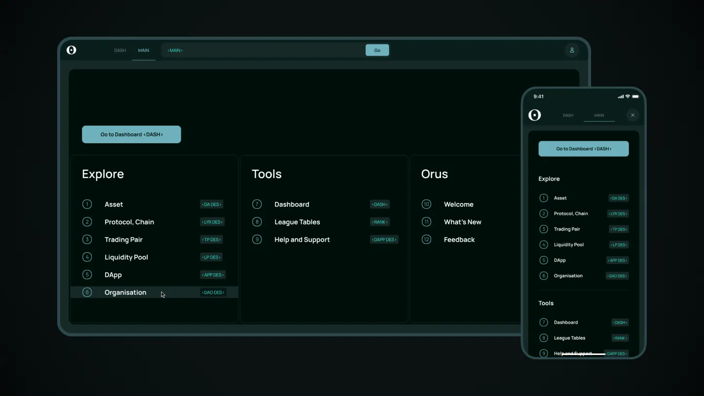
Orus. On-chain data analytics platform
Orus is a robust, large-scale platform designed for analyzing cryptocurrency data tailored to traders. The user interface features a flexible workspace and a versatile toolbar, allowing users to customize their environment to meet individual needs. All data is displayed through intuitive dashboards, giving users the ability to build various types of graphs, compare data, and utilize widgets for deeper insights. The design ensures a seamless and efficient experience, empowering users to make informed decisions with ease.
Blank
Blank is an e-document management system designed to generate common legal and accounting documents. The platform aims to simplify document creation by offering a user-friendly interface with a legal design style. Users can easily edit, sign, download, and send documents via email.
The project leverages the concept of legal design to enhance document circulation, and our role was to develop the entire web app, including its workflow and features, based on the client’s initial idea. Through thorough research, we designed a seamless UX and UI for the platform.
The web portal we built allows users to work efficiently with templates, turning complex legal and accounting documents into clear, easy-to-understand files, all while maintaining the principles of legal design.

Doc Immutable
We designed Doc Immutable, a blockchain-based solution for protecting insurance documents, leveraging AXIS Chain and Web 3.0 technologies. The service focuses on preventing fraud by ensuring insurance documents are securely stored and made immutable within the blockchain.
Our role was to create a seamless user experience for the platform. After registration, users are directed to a web portal where they can easily download their insurance documents and convert them into NFTs. We designed a clear user flow to guide them through the process effortlessly.
To enhance accessibility, we developed a navigation bar for the web, tablet, and mobile versions, ensuring users can quickly and efficiently interact with the portal across all devices. This design helps streamline the user journey and ensures a smooth experience from start to finish.

Building a SaaS product that people love using can take your business to the next level. A good design makes your product easier to use, keeps customers happy, and gets them to stick around (and even recommend it to others). When you create a smooth, hassle-free experience, users keep coming back, and that’s what really drives growth.
Great design also helps scale your SaaS business by making it easier to attract and keep customers. It simplifies the way people interact with your product, guiding them through every step without confusion. The better the experience, the more valuable your users become over time – and that means more revenue without constantly chasing new customers.
If you want a SaaS design that doesn’t just work but actually helps your business grow, Obriy Design Büro got you covered. Write as at hello@obriy.design and we will discuss your project.


.svg)


