

The reasons for the rebranding
Nextpage Agency has achieved significant success in the market, with over 150 successful projects in various niches. However, like any organism, we evolve and strive to become better. Rebranding is our way of showcasing how the company has changed internally and externally, and communicating our new values and challenges.
The brand Obriy Design Büro represents the ideals and principles that are important to every team member and unite us. Our strength lies in the unity of individuality. We value uniqueness, which allows us to be ourselves, show initiative, and make a unique contribution to our work. Individualism fuels our rebellious movement against the ordinary and mediocrity in our work. We always strive for new heights and find creative solutions for each task. We are bold and proactive, confident in our expertise, always professional, and unafraid to take responsibility for our decisions and actions.
The rebranding was carried out by our internal team. Thanks to this, we were able to consider the company’s core values and the character of the people working in it in our work. We immediately decided not to settle for superficial changes but to go deeper and create a new name and style that would reflect our essence. And we accomplished the set tasks.
The origins of the name Obriy Design Büro
We are a Ukrainian company specializing in design. Our superpower lies in our ability to create innovative solutions using digital design tools and pushing the boundaries of business. We were searching for a name that would reflect our values and be understandable to both Ukrainian and English-speaking audiences.
After careful consideration of various options, we settled on the word “Обрій” (Obriy), which became the core of our new name in Latin-script letters “Obriy.” For us, “Обрій” represents the desire to transform and expand the possibilities of our clients and partners through design. We don’t just create beautiful interfaces; we provide solutions that help our clients achieve their goals and succeed in business. We believe that this is our strength. Another important reason why the word “Обрій” is significant is that it is an authentic Ukrainian word. Through our name, we now embody our roots and pride in our national identity.

As for the second part of our name, “Design Büro,” its explanation is quite simple. We are a professional team of experienced designers and other experts who come together to deliver the highest quality services to our clients. This part of our name emphasizes that aspect. Thus, Obriy Design Büro was born: Ukrainian designers with a bold and innovative approach, eager to push creative boundaries through digital design.
A new brand identity for a new brand
One of the most interesting and challenging stages was the complete rebranding process. We decided to change everything: the logo, colors, fonts, website, and social media style. Nextpage’s identity was cyberpunk and futuristic, which was captivating yet complex. Obriy, on the other hand, is modern but no longer cyberpunk. It is vibrant, daring, and embodies individualism.
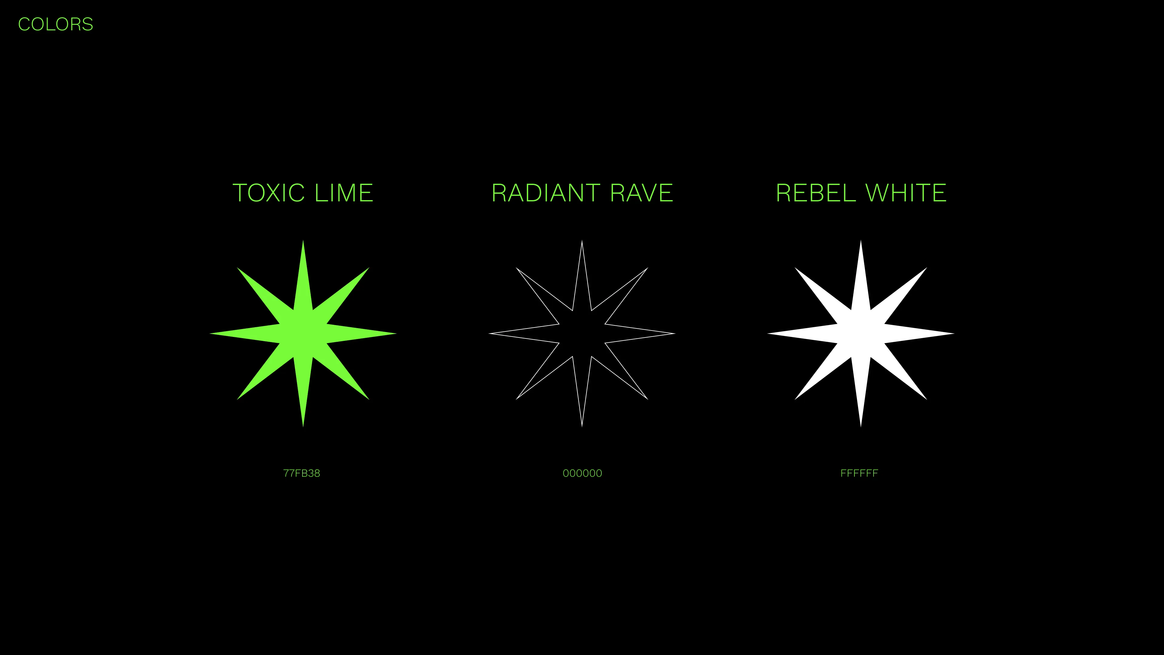
The new color palette consists of three colors: neon green, black, and white. Neon green serves as a unique ambassador of our character, representing a touch of rebellion and individuality. Working with overly vibrant shades of green can be challenging. It requires finding the right balance so that it’s not overwhelming. We found that balance — black and white harmonize the color palette, adding style and monumentality. By the way, each shade has a name generated in collaboration with ChatGPT. Green is called “Toxic Lime,” black is “Radiant Rave,” and white is “Rebel White.”
The previous logo was a diagonally crossed-out square in pink on a black background. We decided to completely break away from the geometry and incorporate the name into the logo itself. The updated logo consists of the word "Obriy" in our signature green color on a black background. The logo mark, the letter "O" with an underline and a star inside, adds a nod to the meaning of the word. It represents the sun rising above the horizon. By the way, the logo mark has some underlying messages that characterize us. For example, you can see the silhouette of a computer. And if you flip it horizontally, you can see binary code. Both interpretations allude to the foundations of the modern digital world.


Another feature of the new style is the use of 3D shapes. Most of these shapes don’t have a clearly defined form, resembling liquid metal in their structure. Choosing the effect of liquid metal was not a random decision. It symbolizes flexibility in our work and openness to innovation. One of the symbols of Obriy Design Büro, the star, is also in 3D.

The part of AI in the process
The creation of a new brand identity and philosophy is only part of the work. Before that, a lot of research is conducted, which requires time and resources. We were able to shorten this time by utilizing ChatGPT. Its algorithms helped us gather, analyze, and structure data about the market and competitors. Additionally, it assisted in generating ideas for marketing materials and improving existing drafts.
It’s quite fascinating to leverage the creative capabilities of artificial intelligence. For example, it generated names for our brand colors. It may seem like a small task, but it contributes to a more complete brand image. Instead of taking up the team’s time, ChatGPT took care of it on its own.
For our team, artificial intelligence has become a sort of colleague in support. We are already using it in our work, significantly accelerating our workflow processes


