In 2024, crypto projects are no longer a niche hobby for geeks. Although cryptocurrencies and blockchain technologies initially attracted mostly technology enthusiasts, they have become much more mainstream. The cryptocurrency market is evolving rapidly, and technology alone is not enough to stand out. Unique digital design, branding, philosophy and values are also important. This is where a special design approach comes in. cryptocurrencies and blockchain technology. For Refund ($RFD), we have created a conceptual and visually stunning branding and website that fully reflects the philosophy of the project.
Refund. Story behind
Refund (also known as $RFD) is a community-driven protocol that ensures decisions are made democratically by the owners, not by a central authority. $RFD combines the principles of decentralization with the credibility and reliability of established blue chip projects. This fusion aims to shape the future of decentralized finance (DeFi) by prioritizing community involvement and creating a sustainable and trusted platform.
Community freedom and democracy are at the heart of Refund. But who is the person behind this intriguing protocol? The origins of Refund can be traced back to the legendary Blurr.eth, a renowned OG whale known worldwide for his innovative approach to decentralization. His famous Punk #9998 was sold for $532 million using his self-created "Flash Loan" smart contract technology.
Blurr.eth launched $RFD on May 19, 2023, as an innovative experiment in decentralization and community-driven governance. Unlike other cryptocurrencies driven by
profit motives, Refund is based on the authenticity and enthusiasm of its supporters. This sets it apart in a crowded market often dominated by influencers and aggressive marketing.
Such an innovative and non-standard project requires design solutions that precisely match its character and help achieve its ambitious goals. While the identity should reflect values and character, the website should be a game changer in the industry, encouraging people to explore and join the community.
.webp)
The brand character
To explain why the identity and the website have turned out the way we see them, it is necessary to delve into the nature of the Refund cryptocurrency project.
The mission of $RFD is to become an important and influential player in the field of DeFi, where the future of this direction will be determined by the token holders themselves. $RFD positions itself as the voice of the real crypto community, striving to be permanent and not disappear like other similar projects. They emphasize the importance of shared governance, where every token holder has a voice.
Refund project embodies the ideals of freedom, anonymity and decentralization that are deeply rooted in the ideology of cypherpunk and the crypto community. Its uniqueness lies in the mystery and anonymity that surrounds not only the project itself but also its participants. They aim to create a platform where every member has a voice.
Blurr.eth, the founder of the project, left 13 messages that became a kind of easter egg for the community. These messages not only reinforce the mystical image of the project. These characteristics underline the main idea of $rfd: to create a space where technology, freedom and decentralization are intertwined, forming a new digital reality where every participant has a voice and their anonymity is preserved. This knowledge became the starting point for the creation of the branding and the platform that will help the community interact.

Building unforgettable branding
Branding is crucial in the crypto industry, allowing projects to stand out in an increasingly competitive market. A strong brand not only helps a project distinguish itself but also plays an important role in attracting and uniting the community around it. For a project like Refund, this is especially important because an engaged community is essential for promotion, growth, and attracting new users. In this case, branding goes beyond simple visual elements; it is a fundamental element of the project's overall promotion strategy, an integral part of its success and growth.

Logotype, colors, typography
The Refund logo is based on the NFT Crypto Punk #9998, which was once sold for $532 million.
The main horizontal logo consists of crypto punk, a typeface part and a slogan. It provides the most detailed and complete representation of the brand.
Vertical logo. This is a simplified version of the logo. It consists of a cryptopunk and a yellow text part. It is used when it is necessary to preserve compactness and simplicity.
The colors and fonts of the shortened version make it as recognizable as possible, even without the use of Crypto Punk.
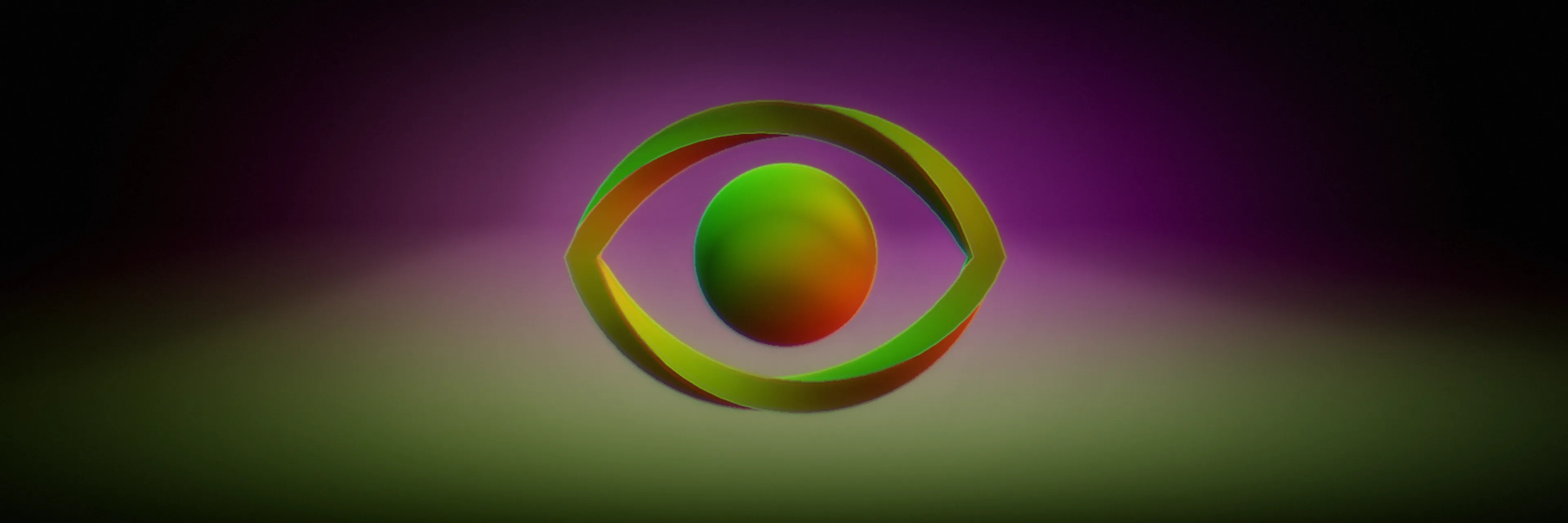
The colors of the logo are important. They also refer to important characteristics related to the project. The colors of the logo have a deep meaning that reinforces the ideas and values of the project. The color green is associated with the command line interface of the terminal, emphasizing the technical nature and connection to cryptographic ideas. Yellow, red and pink colors create the impression of movement and instability, which resonates with the concept of glitch. This symbolizes constant change, adaptation to the new, and the dynamics inherent in the cryptocurrency space and decentralized technologies.
Typography. Road Rage is a handwritten font that has a dynamic and aggressive look, with uneven line thicknesses and elements that give it an expressive, even a little bit frantic character. With its monospaced width, Martian Mono refers to the programming and digital world. This font has a modern, technical look and feel and emphasizes the association with technology and encryption, which emphasizes Refund's focus on technological innovation and data protection. Kvltura typeface has a stylized, handwritten look. It gives the impression of unconventionality, independence and alternative culture.
In general, the typeface pair aims to evoke associations with retro computer interfaces, cyberpunk, data security, and independence. In this way, we sought to combine a futuristic vision with respect for the technological past, thus creating a unique style that appeals to an audience passionate about technology and cypherpunk culture.
.webp)
Encrypted symbols and other mysterious brand identity elements
Another important element of Refund's identity is ideas encoded in symbols that reflect the project's core values. These symbols carry deep meanings such as privacy, mysticism, freedom of choice, and community. Each symbol is unique and contains a piece of Refund's ideology.
In this way, Refund's symbols not only decorate the brand but also serve as a bridge between technology and people, creating a unique digital reality where each participant has their voice and anonymity.

Marketing materials and generic graphic
$RFD is a totally digital project that integrates into digital reality and actively interacts with its audience on the web. To ensure effective communication and clear identification, a brand requires a comprehensive system of marketing materials. These materials include banners, avatars, announcements and other elements that reinforce Refund's brand presence in the digital environment. As additional materials, we created a set of generic graphics, including image templates and graphic effects.
These materials allow Refund to maintain its place in the digital space, ensuring continuous contact with the community and emphasizing its core values.

Creation of a game-changing website
You may have probably already noticed that Refund is a rather non-standard project. Especially from the point of view of what has been created in the world of cryptocurrencies in the last few years. Confident, sometimes eccentric, cares for his audience and keeps its secrets. Their main digital platform should be a complete reflection of what this project is all about.
Creating a website for the Refund community was a key step after branding and one of the most important tasks.
We faced the following challenges:
– Design a website that accurately reflects the core values and ideology of the project.
– Create an immersive and interactive user experience that engages from the first interaction.
– Incorporate 13 cryptographic messages into the design that appear as you scroll through the page, adding an element of mystery and intrigue.
– Carefully consider animations and interactions so that they complement the overall style.
– Provide an intuitive and smooth user experience that avoids information overload and focuses on making the visitor want to explore the site further.
In the beginning, we created a sitemap, determined the number of pages, their logic, and how to provide an immersive user experience. UX prototypes of the pages made it possible to optimize the user experience before starting to create the concept and to get a clear idea of the appearance and function of the main elements of the interface. After that, we started creating the interface and implementing all the points listed above.
We have created a unique immersive experience that captivates the user and involves them in the digital world of the Refund project, reinforcing the sense of belonging to the community and its philosophy. We offer the user not only to read information but to actively interact with the content.
The entry page starts with a preloader and an invitation to begin the journey by jumping down the rabbit hole. Users land on the main page and begin to gradually immerse themselves in the website’s experience. As they navigate through the pages, they follow the white rabbit, uncover hidden Blur.eth messages, and delve deeper into the intriguing world of Refund. Also, during navigation, the user can find hidden elements or information, which makes the interaction more interactive.
Smooth animations and visual effects are activated when scrolling or interacting with page elements. For example, certain text or images appear or move as the user turns the page, creating a sense of dynamism and engagement. Built-in 13 cryptographic messages that appear on scrolling add an element of mystery and interactivity. This encourages the user to delve deeper into the content and creates a sense of participation in something exclusive.

The color scheme enhances the sense of mystery and immersion. The use of contrasting colors and graphic effects adds a sense of depth. Some design elements look like an AR effect, creating the impression of a three-dimensional space. The sound effects enrich the emotional response from visiting the site.

Refund is a groundbreaking project with the potential to redefine how crypto projects are created and launched in the future. Obriy Design Büro designed everything essential for a successful business launch: from branding and marketing materials to a dynamic digital platform in the form of an interactive website. Brand identity ensures the project stands out in a crowded market, capturing attention and sparking interest. Whether it’s on social media, DEXTools, or a cryptocurrency exchange, Refund’s presence attract attention. The website serves as a cornerstone for the community as a place where users can actively engage with the interface, access information, and become part of the community.
To learn more details about the project check our project page.
Visit live website by the link